Then made quite a few apple drawings. Here is one on A3 size papeer. Also instructive, a difficult exercise to try and pick out the tones and the forms in the apple. Made a guess really, I am afraid to say.

Then made a little painting 20 cm square. Feel as though I have never painted before, it is a week or so since I did the still life. But the drawings were helpful, I made some guesses, and found the background cloth more interesting than the apple. The photo shows the lines on the surface rather badly, but apart from that it does not look bad! Next a plant painting.

Starting on next part of this project, a still life of a plant in room. Here is a photo of the set up plus two initial drawings.


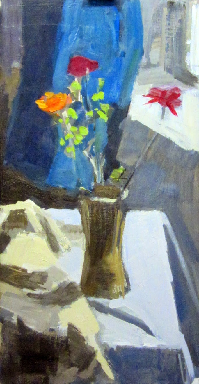
Long narrow colour sketch started today. Needs more looking re shapes and tones and so on. Blue background not right, also other bits of background, but it has a surprising feeling of light and life!!! Will do another session on this, then start on "proper" version.


 |
| Greyscale photo of subject |
Weighed in immediately and impulsively on arrival in studio today, decided it needed to be redrawn, changed size and position of vase down slightly, this gave more room for the cloth at the back, got the perspective of window sill and table better, maybe got tones better. Did this in two sessions first moment then later on for half an hour. Light less good today, seem to have made everything lighter in the painting now. Composition problematic and I am squashed in a corner. Think in next study I will think in a more abstract way, top left corner could be darker, and I need to look again at the colours in the cloth on the table. I like the way the window sill has now come out, also the table, and the shape (though not tone and form and colour of the blue cloth in background). Vase and flowers OK for now. As usual need to try and go more slowly. Looking at the greyscale photo the shadows on the blanket are quite dark, and that would make for a better composition. The blue turquoise nearer light is about right
 | ||
| Sketch final version |
No comments:
Post a Comment