Thursday 29 January 2015

STARTING ON COLOUR

Colour wheel side view showing freshly painted texture!

The next section in the book is about colour theory.  The first part involves mixing the primaries, then gradually adding black and white. Here is step one.  I am just beginning.  The light was bad, and I will have to redo the mixing.  I have done this exercise many times before, but it always feels like a journey of discovery.  This time however I will go more carefully, and will keep other work going meantime to keep me fresh


A section of the colour exercise

The first palette!


I completed the first exercise, and today (3rd February) I started on the second exercise - painting the colour wheel.  I have done this so many times before, but this time it was different. I really concentrated on what I was doing and I used the paint thick.  Because of my previous work with dye I have generally preferred a thin watery feel to colour, but paint definitely needs to be thick.  Enjoy the beautiful texture and let that be its three dimensional quality!  Also I have always tried to economise with paint - big mistake.  Using paints such as oil or acrylic to explore colour really only works if you are working on paintings or something that needs a firm non absorbent ground.  Dye is so much more fluid and the colours behave differently.

Detail of the colour wheel with strips of added white paint to show true colour better


Colour wheel with strip version
Here is the strip from above in greyscalefrom the phone app
Here is my required eight tone strip painted

Colour wheel and tone


The exercise here was to take each of the 12 colour wheel shades and assign them on a tonal scale.   I cheated a bit, photographed the shades and translated into greyscale, then compared them to my tonal ladder, result above. Very difficult to see colour in tone!

Wednesday 28 January 2015

MONOCHROME PAINTING - THE HORSE

Photograph taken in Newmarket 2012


A monochrome sketch of the same subject 2015  acrylic on board


Two years ago I did a series of paintings based on the Newmarket visit of 2012, but this is one I really struggled with.  I could not get the drawing or the composition right and I scrubbed it off and abandoned it. But it was always there, and today I painted over it using the monochrome technique of three colours (black, yellow ochre and white), and thinking first in terms of negative shapes and then of tone.  Looking at the sketch now, I can see how rough it is and also how I have not got the legs quite right, but I felt a lot more confident, and looked at it much more in terms of composition.  For example the pattern of shadow is as important as the horse itself.  I will work a bit more on it to clarify the background and the horse's body, but not too much as I like the looseness of it.

Next day

Same picture with more drawing


I drew into this with charcoal, and found lots of inaccuracies. Added a bit of paint, but mainly drew the shapes today.


Saturday 24 January 2015

MONOCHROME PAINTING


Above is the drawing I have selected to take forward as a painting.  It was the first of the series of charcoal drawings.  It is not the most successful drawing, but I think the simple shapes and composition will make it a good subject to paint.  We shall see.

Monochrome drawing  First attempt
 Here is the first attempt (above).  I was not sure what I was supposed to be doing, which were the positive and which the negative shapes.  Coming back after a couple of days, I decided that I would choose the objects as the positive shapes, and paint the drapery and other components as fully as I could tonally and spatially given the three colours.

Photo of the subject

Greyscale of the photo

Painting 2

It seemed a bit pointless working like this, since I was supposed to thinking in terms of tone except for the objects, which were to be painted in overall flat monochrome.  I did not work very carefully on the surrounding negative shapes in terms of tone and texture, but in the end it was an interesting exercise.
I would quite like to go on and do an abstract painting from this.  May do so while I revise the colour theory section, which comes next.

Willam Scott  Venice Biennale 1958

William Scott Winter Still Life 1956

Painting by William Scott
Next day - I was looking at the paintings of abstract still life painter William Scott (above ) and wondered if I could do a monochrome abstract in a similar way!  I did try, and found that the shapes were more familiar and easier to draw, but that trying to paint in this was very complex - of course, as Scott will have arrived at this approach after many years of experimentation and effort.  I decided to scrub the painting and try again another day, but what resulted from the deletion was the image below.  I like it!  It has a feeling of light and space. Scott often uses a very limited palette.

Tone painting


DAYS 4 AND 5 AND BEYOND

View 4 photo
View 4 greyscale

Drawing 4 charcoal


 Today I tried a 4th viewpoint, but it was getting dark by the time I sat down and the light direction is unclear.  It is mostly coming from the overhead fluorescent tubing on left rather than daylight on right. Also I could not focus very well on the tone.  I am getting more interested in the form and solidity of the subjects, and it is not satisfying or effective to try and just do shapes and tone!  I cannot see that very clearly.  I like to understand the form so that I can then play with it and walk round it - rather like a three-dimensional computer programme.  The flat surface approach does not entirely work for me.

Now I am more familiar with the subject I will try a more analytic approach, just focussing on the forms, and maybe tone will make more sense then.  But better not to get stuck on this very first exercise!  This drawing definitely needs another go, however.

So far, drawing 2 is still the one like best. 

Day 5 photo
Day 5 greyscale

Drawing 5 charcoal


Day 5   Similar viewpoint but approached subject by thinking about it as structural forms rather than patches of light and dark.  I thought about the tone afterwards. It is a very rough drawing but I enjoyed working out the shapes.  The  light got bad as it was late afternoon (almost dusk) and the light source is confusing.  The greyscale photo helped establish the tones.

Also thought about what interested me about the still life, and decided it was the patterns, the colours and the textures, as well as personal associations of the objects..  So not principally the form or the tone! 

I am getting to know the still life and seeing different things in it and understanding it enough to start experimenting.  But time to move to next exercise - using paint!  
Extended version of Drawing 5


Here (above) is the last part of this section, where I have placed Drawing 5 on a larger sheet of paper and extended it all around by about 2 cm.  I like this extended version better, it gives the subject breathing space, and also it was a chance to create an imaginary environment.

MY PAINTING PROJECT MORE DRAWINGS

Same still life but different viewpoint

Here is the greyscale version
My drawing informed by greyscale


I made another drawing today (above) from a different angle, and I looked at the greyscale picture.  This drawing I like more, it has more atmosphere, and a sense of place. I struggled to get the shapes and proportions.  I have not drawn for a few weeks and quickly get out of practice in looking.


Going up close


 Today I zoned in a bit close.  It was a simpler composition but making it work was difficult.
I struggled with the tone and form of the vase and that was the most rewarding part.  The drawing then looked very flat so I edited it by emphasizing the bar of the display unit at the top (actually out of the composition) and softening the drawing of the cloth (actually a ribbed sweater).  The greyscale shot was not that helpful.  This composition was difficult to get because it was so simple and depended on excellent tonal balance, which is very hard to achieve.  I compromised because I felt the selection I had made was not worth a big struggle, I did not like it enough, and also the light was bad, the studio windows were frosted over and I was cold!  Difficult not to get seduced by the beautiful flower pattern on the vase, but that is a different subject.

MY PAINTING PROJECT - BEGINNING


Setting up a still life
Changing it to greyscale on my phone app

My first tonal drawing (without greyscale app)

Back to basics.  I  wrote a book on equestrian drawing last year and want to develop ideas and skills I learnt and understood better by now working through a painting manual (Open College of the Arts Painting 1). I have tried this before but this time I feel confident enough to follow the exercises with more detachment, and I will see where it takes me.

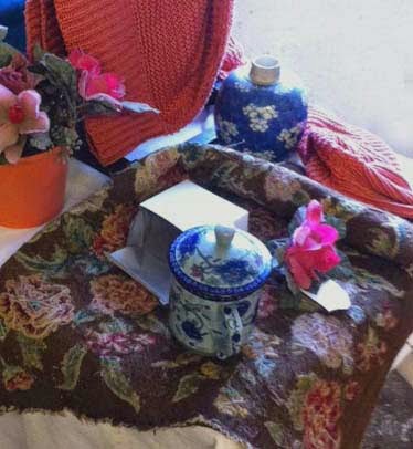
I set up the still life for the first exercise today and made my first drawing.  The aim was to establish the tones rather than shapes, but looking at the greyscale photo it is clear that my perception of tone is not particularly accurate, and that I was not thinking where the principal light source was (the daylight on the right)..  I will make another drawing from a different viewpoint next time, and use the app as well.  

I am not following the tutored course, but plan to work through the book at my pace.